The newly released “Forty Years of Fabulous” The Kips Bay Decorator Show House by Steven Stolman is the perfect Mother’s Day present for my mother and perhaps for yours, too.
Every year, the Kips Bay Show House evokes so many memories for me. Years before I was a designer, my grandmother, mother and I attended many of their show houses together. My grandmother designed homes for all family members and my mother has a keen architectural eye so it was an education going with these two astute and elegant women. Years later, my mother brought me again to Kips Bay for inspiration for our new apartment. My most vivid recollection is when I was 9 months pregnant and late, my mother took me up and down stairs to view countless rooms, hoping to accelerate her grandchild’s birth. Somehow that outing must have had an effect on the baby, because Ashley now works with me at DecoratorsBest.
Some memorable rooms for me include:
Ruben de Saavedra
Back in the day, interior design styles were much more elaborate than they are today. However the slipper chairs are a classic, and so many years later, I still have the exact same ones in our living room- without the bullion fringe for today’s simpler look.
Robert Metzger
My family knew Robert Metzger and I always enjoyed seeing his rooms at Kips Bay. This is the room I saw on that memorable excursion being pregnant.
Jeffrey Bilhuber
As a traditional designer, I always admire what more contemporary designers do with their simplicity and clean lines. I first saw Jeffrey’s work at Kips Bay and have been an admirer ever since.
Interior design today, like fashion has no rules. It’s all about expressing yourself in your own unique way. Here are some tips to help guide you to fulfilling your creativity.
The bright suzani print on the chairs ties this room together. Taking its cue from the circle in the print, the drapery fabric has a yellow background and its embroidery plays on the circular motif.
Tip: Use an accent color from the main pattern for a complimentary color. Subtly use the same motif around the room.
All of the colors in this vivacious room emanate from the imaginative painting. The black and white wallpaper is dense and intricate which blends well as a backdrop for the artwork. The white ground of the embroidered yellow drapery works well with the solid orange chairs and hot pink throw pillows.
Tip: Use artwork as a focal point for a room and select colors from the painting.
A strong repetitive wallpaper makes a statement on the walls whereas the complimentary color blue in the rug serves to ground the room. Both patterns are united by their colors with white lines. Blue and Yellow are two of the primary colors and are a tried and true combination.
Tip: Combine 2 strong patterns by using complimentary colors with similar designs and the same scale.
The gray and yellow ethnic fabric on the sofa is the dominant pattern for this space. All pillows and colors revolve around it. The pillows are smaller scale designs with some of the same colors. Although the floor pattern is large, it showcases the love seat.
Tip: Harmonize with a large pattern using smaller scale prints in the same colorways. Use a two toned large pattern to act as a background for the multi-colored one.
Downton Abbey is back again, and we couldn’t be happier to watch the glamorous British bunch for another season. Check out this behind-the-scenes look at some of the most stunning rooms featured on the series & how to get the look.
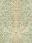
The saloon is one of the most architecturally grand rooms in Highclere Castle, where most of Downton Abbey is filmed. The gothic style decor is accented by wall covering panels made of leather that date back to 1631, but you can get a more modernized look with a deeply-hued damask wallpaper.
The study is where we often see Lord Grantham mulling over his estate’s future. The gorgeous wood panels and inset shelving are adorned with a vast collection of leatherbound books. If you want to recreate this look without installing ornate paneling, you can use a trompe l’oeil wallpaper that looks like bookshelves. Rich velvet and silk textures provide a softer contrast to the masculine room.
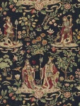
We saw the music room last season when the family held events, and we hope we can see more because those walls hung with 16th century Italian embroideries are to die for! The ornate architectural carvings can be recreated with a trompe l’oeil freize wallpaper–some of them are printed to look 3D and others are actually raised and paintable.
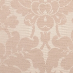
The drawing room is one of our favorite spaces from the show—its pastel color palette brings an airy quality to the castle. We’re loving the combination of mint damask wallpaper,dusty pink chairs in a similar pattern and a quietly elegant area rug.
Happy #FabricFriday! Get a look at the whimsical twist that Lee Jofa’s Flying Ducks pattern gives this turn of the century settee. We like the way that Richard Grafton Interiors used it in a room with intricate wood detail!
Where do designers get the inspiration for their collections? We got the scoop from Nate Berkus, John Robshaw, Thom Filicia, Kelly Wearstler and Eileen Kathryn Boyd on what drives their work and gets them excited to design:
Nate Berkus, former daytime talk show host & current owner of the Nate Berkus Associates interior design firm, pulled inspiration from his travels when putting together his first collection for Fabricut. Sprinkled with Moroccan-themes and rich color, this modern line looks as though it was inspired by a vacation to an exotic place. “I always come back from a trip with a ton of new ideas,” Nate says. When he isn’t traveling, Nate looks to art, architecture, and history for design insight. Check out some of his latest patterns for Fabricut:
A world traveler at heart, textile designer John Robshaw has scoured the globe, including Uzbekestan, Lima, and Bolivia, to get ideas for his patterns. After drawing from vibrant cultures, John then “goes out on a limb,” thriving on experimentation. Check out his collection for Duralee, which holds true to his global aesthetic:
Thom Filicia has been drawing on everything he could get his hands on (much to the dismay of his parents) since he was young. “It’s funny, I look back, all the things I got in trouble for when I was a kid, you know, drawing on my desk or moving things around the house that I didn’t like are now actually what I do for a living.” The New-American designer known for revamping homes on Queer Eye for the Straight Guy follows the motto, “What inspires you, inspires me,” in that he looks to interesting aspects of the clients with whom he’s working to spark ideas. Thom also loves timeless fabrics, and when creating his latest line for Kravet, he started with this in mind, and then injected it with color and texture to create an “incredibly fresh and cool interior.” Check out some of his collection:
Kelly Wearstler, the popular designer and esteemed judge on Bravo’s reality show Top Design, draws inspiration from vintage pieces. “I love things that are old and have more soul and are spirited.” Her anti-minimalist style, dubbed “maximalist,” echos the glamour of bygone eras like ’70s disco and is apparent in her latest collection for Groundworks. When describing her design process, Wearstler explains, “It changes. Everything starts with an idea…Then, I take that thinking and do vibe boards and I’ll put inspiration together and then sketch.” Check out some of Kelly’s latest designs:
Known for her color expertise, influential New York interior designer Eileen Kathryn Boyd draws upon art to inspire her work. She especially finds Georgia O’Keeffe’s & Kandinsky’s abstract pieces to be particularly illuminating when creating patterns. Boyd is also known for bringing the latest fashion trends to interior design, seamlessly melding the two worlds. Check out some of Eileen’s colorful collection for Duralee:
GP&J Baker was founded in 1884 by famed gardener and entrepreneur George Baker and his two sons George Percival and James. The Bakers employed leading Arts & Crafts designers and collected antique block prints along with rare cotton prints from India, creating an extensive library of both archive documents and textile designs. Detailed flowers and naturalistic imagery were translated from hand painted works of art into fabrics and wallpapers applicable for everyday use. Floral chintzes became archetypal of the GP&J Baker house and have endured as their signature style.
GP&J Baker’s greatest accomplishment has been its ability to remain modern while honoring its legacy. Under the direction of Creative Director Ann Grafton, GP&J Baker has updated many of the original textiles with modern colorings to create fabrics and wallpapers that are reminiscent of the Arts & Crafts style and, at the same time, contemporary. Most recently, GP&J Baker has released itsCrayford collection, which features several rich-colored archive documents in fabric and coordinating wallpaper. Read more about these historic textiles to give your decor a classic twist:
Nympheus 1915
Contemporary Office (2013) & Original Block Print Archives (1915) Photos via GP & J Baker
Adopted by Arts & Crafts artist William Turner from a Ming dynasty painted silk scroll, Nympheus depicts drooping lotus leaves sheltering kingfisher birds. This large floral pattern has a mysterious quality that makes it hard to identify as antique, retro, or contemporary. Its distinctive lines and block colors make it relevant to today’s decor.
Original Haite Watercolor (1903) & Contemporary Kitchen (2013) Photos via GP & J Baker
GP & J Baker first used the leading Arts & Crafts artist George C Haite’s watercolor “Leaf Cascading” as a hand-block print in 1903. Haite’s “freely-brushed clusters” of foliage are representative of the artist’s style and flow together like a well-groomed garden. Bring a sense of the English countryside into your home with Leaf Cascadingdrapery or upholstery.
Imperial Pheasant Fabric (2013) & Original Document Sketch (1915) B Photos via GP & J Baker
Designed by Sidney G. Mawson for GP&J Baker in 1915, Imperial Pheasant portrays the contrasting aspects of love and nature by juxtaposing sweet magnolias with poisonous oleander flowers. Originally printed using 72 different blocks and featuring both pheasants and turtle doves, this textile has been revamped to accommodate advanced printing methods. Available as a wallpaper as well as a fabric, Imperial Pheasant’s vivid and on-trend colors enhance the exotic flair of the pheasant, magnolia and oleander flowers. Introduce this print into your polished decor to create a lively atmosphere.
Traditional Drapery (2013) & Original Indian Cotton Hanging (1900s) Photos via GP & J Baker
Originally featured as a plate in George Percival Baker’s 1921 publication Calico Painting and Printing in the East Indies, the “Bamboo Bird” painting was inspired by an 18th century hand painted Indian palampore, or cotton hanging. In 1915, GP&J Baker designer Burn was asked to transform the original painting into a block print. Burn maintained the central motifs and adapted the palampore into a symmetrical trellis. Birds perch along intertwining branches that create a diamondtrellis with an all-over leaf background. This pattern looks stunning in a more traditional setting.


 S Harris


 York
York Pindler & Plinder
 Stroheim


 Stroheim
 Jaipur


 York Wallpaper
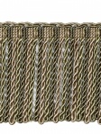 Fabricut Trim
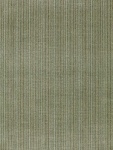


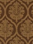
 Andrew Martin Wallpaper
 Greenhouse Fabric

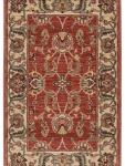
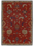
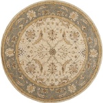 Surya Rug


 Cole & Son Wallpaper
 Surya Rug
 Downton Abbey Decor
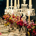 5 Ways to Bring Home Downton


 Man Caves for Every Dad
 4 Guy-Friendly Decorating Ideas
 Man Caves for Dad
 Top 30 Projects from DIY Network’s Man Caves


