Give the metallic trend a new spin with a shimmering textured wallpaper. This room, decorated by top design firm Cullman & Kravis, is the perfect example of how to use metallic textures as a neutral. By framing a gilded grasscloth in panels, they’ve given impact & dimension to the area without overwhelming it, providing an ideal backdrop for statement furniture & something bright, like Tangelo orange drapery.
Fabricut’s brand new metallic wallpaper collection pulls influences from luxurious old Hollywood glamour. Each pattern is screen printed with glitter inks that give the paper a luminous sheen. On trend for spring and summer, these patterns in rich cobalt, burgundy & teal are tinged with metallic shimmer to make your home sparkle.
Looking for a quick way to add drama to a room? Draw the eye up by putting wallpaper that mimics metal tiles onto your ceiling. Depending on the look that you’re going for, you can choose a paper with high or low sheen, or even give the space an antique feeling with a distressed version.
Spring fashion week got a chilly blast with icy blue hues gracing the runways of Tom Ford, Marc Jacobs & Krizia. Bring this trend from the catwalk to your home by pairing it with white prints and solids in down-to-earth textures to make it work for the spring/summer season.
When fall arrives, we at DecoratorsBest always look forward to Holiday House NYC, which opens today through December 18th. The Academy Mansion at 2 East 63 St. provides an elegant home for the lucky group of designers who are given permission to stretch their wings in this palatial setting.
One of the hallmarks of this show house is an integrated flow of rooms thanks to the efforts of Holiday House’s founder, Iris Dankner, a stickler for detail. This year most of the rooms are livable and traditional with a twist. Dark, solid colors prevail while patterns are used as accents, like on pillows. In addition, every ceiling—the fifth dimension of a room—has been adorned with upholstered fabrics and wall coverings to complete the look of each space.
Check out our favorite looks from this year:
Cullman & Kravis
Cullman & Kravis, known for elegant and tailored rooms, created a glamorous sitting room. They were inspired by the show stopping black and silver metallic roman shade fabric and also the colors on the cover of their new book – shades of orange, cream, gold, silver and a touch of leopard.
Inspired by a recent trip to Scotland, Patrik Lonn designed the richly carved wood-paneled study for “cozy holidays in a Scottish country house.” Many varieties of tartan textiles create the traditional & rustic atmosphere, and the photographs of beach scenes bring an unexpected edge to the room.
Get a Similar Look:
Ralph Lauren Fabric – Turnbell Plaid – OriginalRalph Lauren Fabric – Tisbury Madras – KhakiAndrew Martin Wallpaper – Regent – Oak
J. Cohler Mason
“New Year’s Day,” the master sitting room at the Holiday House designed by J. Cohler Mason, provides a calm setting. Featuring a striking portrait over the mantle (entitled The Deb Suite by Deborah Kass), this inviting room has sophisticated and clean lines in furniture selection. A play of patterns including glen plaids, geometrics and chevron stripes, plus pops of color inspired by the artwork, unify this setting.
“St. Patrick’s Day,” conceived by the charming and multi-talented Patrick J. Hamilton, is a young Irishman’s sitting room. Patrick, also a writer and photographer, created a complete backstory for this room and an imaginary client that lives in it—Situated in a Dublin row house, a young man inherited this home along with many antiques and layers of ancestral lives. A deep emerald velvet sofa that blends into the wall is mixed with manly heirlooms as well as modern elements like the Mongolian Sheep bench and the gilded Demitree side table.
Get a Similar Look:
Lee Jofa Fabric – Dalton Velvet – Emerald
Weitzman-Halpern Design
“Sweet 16 Bedroom,” by Weitzman-Halpern Design is the most unique room of Holiday House 2013. Just when you thought you had seen everything, Flavor Paper now creates Instagram wallpaper from your very own Instagram feed, which was used as an accent wall in the room! This brings the new word of 2013, “Selfie,” (mentioned on the Today Show this week) to a whole different level. It’s what our kids’ lives are all about!
Mixing prints and colors is easier than it looks, and doing so makes a room look exciting and fresh. Here are three tips from experienced designer Barbara Karpf:
Color-Block
Color-blocking is back as a trend in both fashion and interior decor, and it’s easy to pull it off if you follow two rules. First, build a room of color around one pattern. Here solid blocks of red, green, yellow, and pink are drawn from the nightstand’s table cloth pattern. Second, add monochromatic elements to the room. The red lampshades pictured below match the wall color so closely that they nearly blend in, which keeps the bed as the focal point.
Photo via HGTVGreenhouse Fabric – 99324 – Cosmopolitan at DecoratorsBestScalamandre Fabric – Kuba – Yellow and Gold at DecoratorsBestDuralee Fabrics – 15255 – Tomato at DecoratorsBestStout Fabric – Glint 57 – Shrimp at DecoratorsBest
Keep It Simple…
If you’re working with a small room, you can still mix prints, but allow one print to be the main focus. A large pattern, like this Ikat wallpaper, won’t be overpowered by simple prints that pick up color from it. Here, the stripes on the bedding and window shade echo the red and yellow on the walls.
Photo via Elle DecorSchumacher Wallpaper – Nasrid Palace Mosaic – Persimmon at DecoratorsBestKravet Fabric – 32144 – 1635 at DecoratorsBest
Duralee Fabric – 32081 – Tangerine at DecoratorsBest
…Or Go All Out
Contrary to popular belief, mixing several bold patterns can be tasteful, not to mention extremely fun. The trick is to use patterns of different scales that have one or two similar colors in them, which keeps the effect cohesive. In the room pictured here, nearly all of the prints contain pigments of orange and blue.
Photo via Jaima & Co.Cole & Son Wallpaper – Gondola – Blue at DecoratorsBestSchumacher Fabric – Chiang Mai Dragon – Lacquer at DecoratorsBestStout Fabric – Borneo 1 – Coral at DecoratorsBest
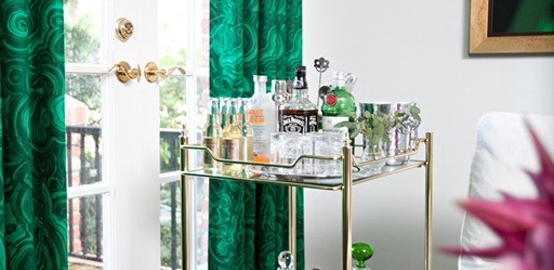
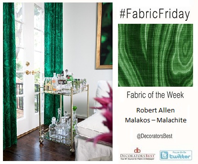
Happy #FabricFriday!Itching to step out of the box this year? Update your home décor for 2013 by dressing your French doors or windows with stunning on-trend emerald green drapes in a slightly psychedelic pattern.
Happy #WallpaperWednesday everyone! Since Pantone has named Emerald Green the color of 2013, why not try a playful wallpaper this year that incorporates the color? Cole & Son’s Palm Jungle in Green-Black is bright and its large-scale pattern is perfect for an accent wall.
Happy #WallpaperWednesday! This Cole & Son wallpaper has us inspired to catch up on some reading. A great wallpaper for a study, library, or reading room.
Yay! #FabricFriday is here again! This cut velvet maze-like geometric pattern has been the talk of the office this week. We love the way it looks AND the way it feels. Snag it for yourself during our 5% off promotion.
Happy #WallpaperWednesday! This week we’re focusing on staff favorites. DecoratorsBest’s President Barbara Karpf loves Celerie Kemble’s wallpaper line for Schumacher. She especially adores Cirrus Clouds – Plume.
“This line is full of quality grasscloth textures with creative graphic designs. If you want something really special, this is it!”