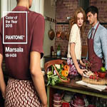
Pantone’s Color of the Year for 2015 is Marsala! Check out these four color pairings that will help you decorate with the hue like a pro.
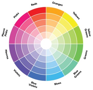

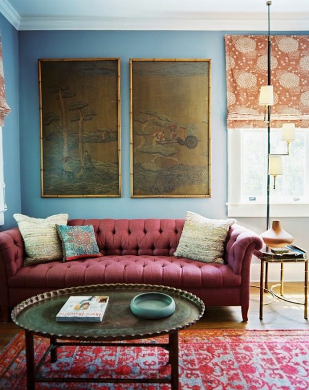
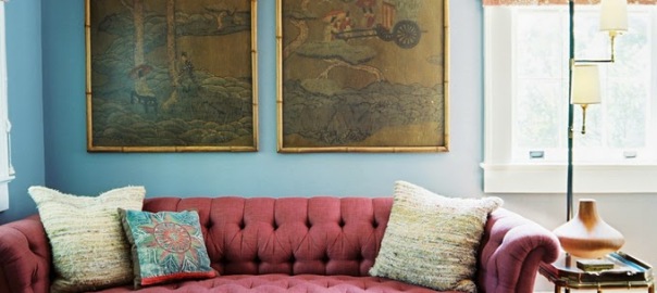
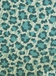
Turquoise lies on the opposite side of the color wheel from Marsala, which makes it a complementary hue to the Color of the Year. The two can be used equally throughout a room. Think turquoise walls with a marsala sofa and area rug, which is done so well in this living room.
Get a Similar Look:

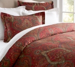
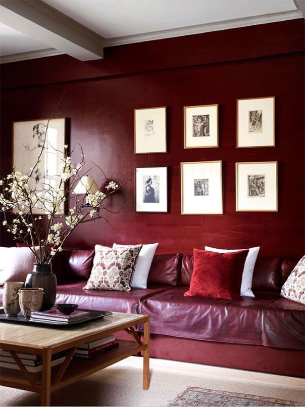
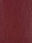
Marsala lends itself well to the monochromatic color palette due to its subdued, rich and warm qualities. Layer different textures like velvet, leather and suede together, and vary solids and prints to break up the look. Switching up the shade of the color brings a little more depth to the space, too.
Get a Similar Look:

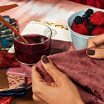
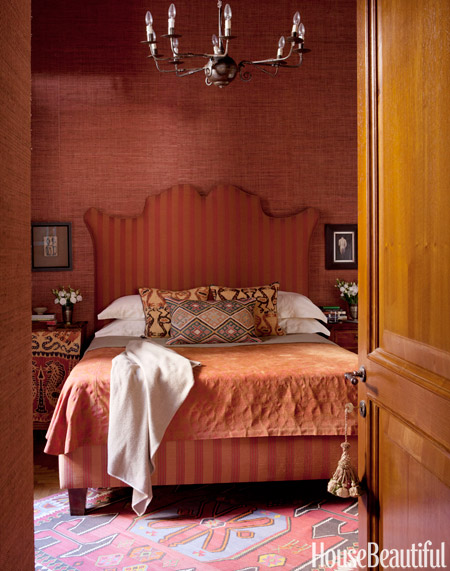
Rust and umber colors, both in matte and metallic versions, lend a spiciness to Marsala. “Anything that has the brown, coppery feel is obviously going to be a natural–it’s closely related to Marsala, but different enough.” says Lee Eiseman, Executive Director at Pantone Color Institute.
Get a Similar Look:

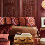
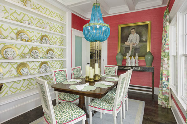
Thanks to Marsala’s strong brown undertones, it can actually play as a neutral. When used as an accent, it works well with a combination of many colors and prints. Choose a pattern containing all of the colors you’d like to use in your room (including marsala) and then reiterate those hues in other pieces.
Get a Similar Look:
Related Articles:
For more on this unique trend, sign up for our Newsletter.
And check out our Facebook, Google+, Pinterest, Twitter, and Tumblr pages!


 Surya Pillow
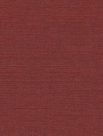
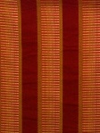
 Clarke & Clarke Fabric
 Duralee Fabrics
 Kravet Fabric
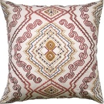 Ryan Studio Pillow
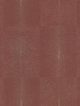 Ralph Lauren Wallpaper
 Fabricut Fabrics
 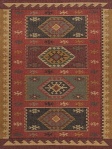 Jaipur Rug
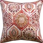 Ryan Studio Pillow
 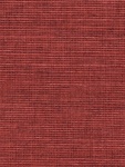 Phillip Jeffries
 Pindler & Pindler Fabric
 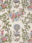 Robert Allen Fabric
  Schumacher Wallpaper
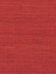 Phillip Jeffries Wallpaper